Other Styles1
- Mark Bloom
- Diana Ovezea
OTF, WOFF, WOFF2, Variable
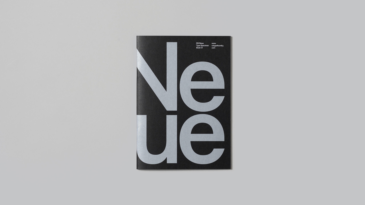
RM Neue takes inspiration from utilitarian neo-grotesques, and positions itself as a timeless and versatile addition to any designer’s toolkit. Its compact proportions and low-contrast design create a familiar aesthetic that feels approachable without the sterility often associated with grotesque typefaces.
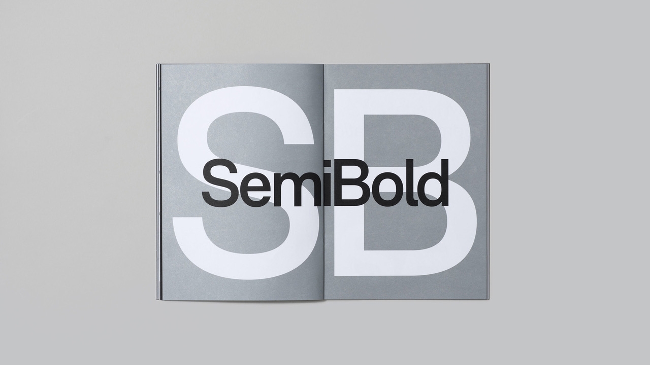
Available in five weights – Light, Regular, SemiBold, Bold, and Black – each with matching oblique italics, RM Neue supports an extensive range of languages via its Latin Extended A unicode set. RM Neue’s slightly heavier Regular weight delivers greater impact at larger text sizes (12–16 points), making it ideal for modern websites, zines, and other minimal layouts. For even greater control, variable font technology enables precise fine-tuning, giving users seamless access to any weight or style they need.
The ascenders in RM Neue match the height of the capitals, prompting the addition of a curly serif to the default ‘l’ for better distinction from the capital ‘I.’ OpenType features provide access to an alternate single-storey ‘a,’ a simple ‘l’ without the serif, as well as an alternate ‘R,’ ‘G,’ and ‘3’ — offering additional flexibility. Striking at display sizes and highly legible in text, RM Neue is a workhorse sans-serif that combines distinctive personality with professional functionality.
Originally introduced as RM in 2011 and refined as RM Pro in 2016, RM Neue represents a complete redesign and expansion of its predecessors. With more weights and enhanced versatility, it offers a fresh take on a proven classic, with a last update in summer 2025.
- 1LightItalic1
- 2RegularItalic2
- 3SemiBoldItalic3
- 4BoldItalic4
- 5BlackItalic5
RM family
- Go to RM Mono
RM Mono
RM Mono5 styles

