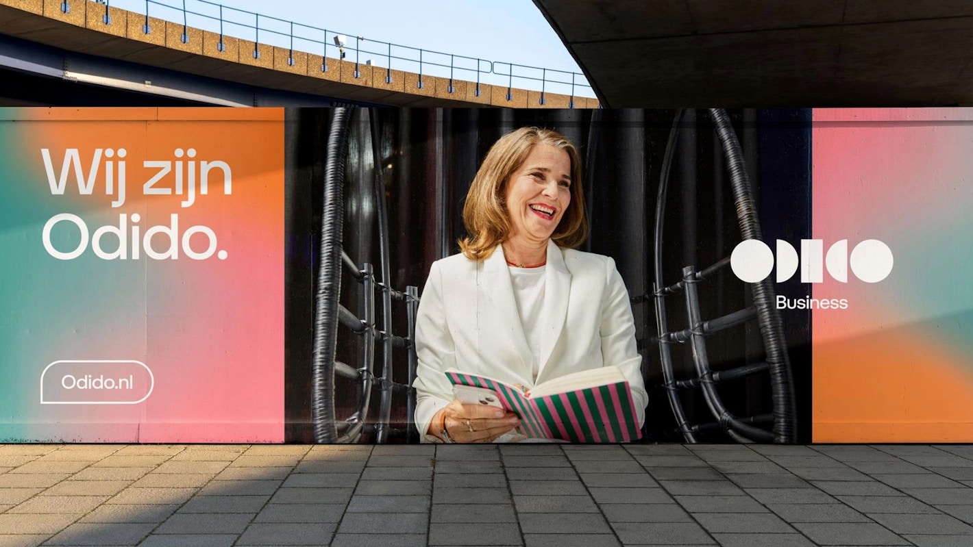
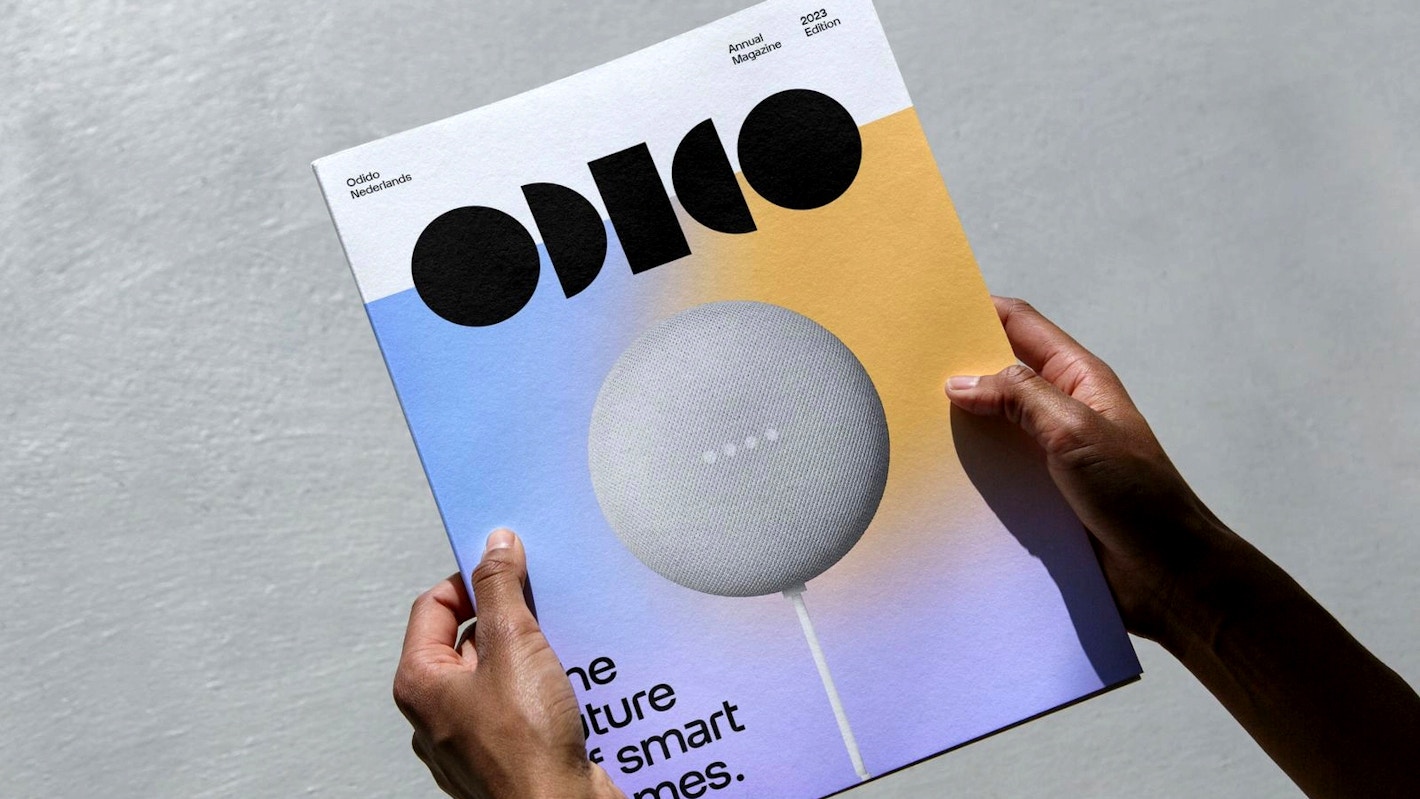
Odido
We are very excited to share our custom typeface Otypical designed for Odido Netherlands B.V. (formerly T-Mobile Netherlands) and commisioned by TBWA\NEBOKO.
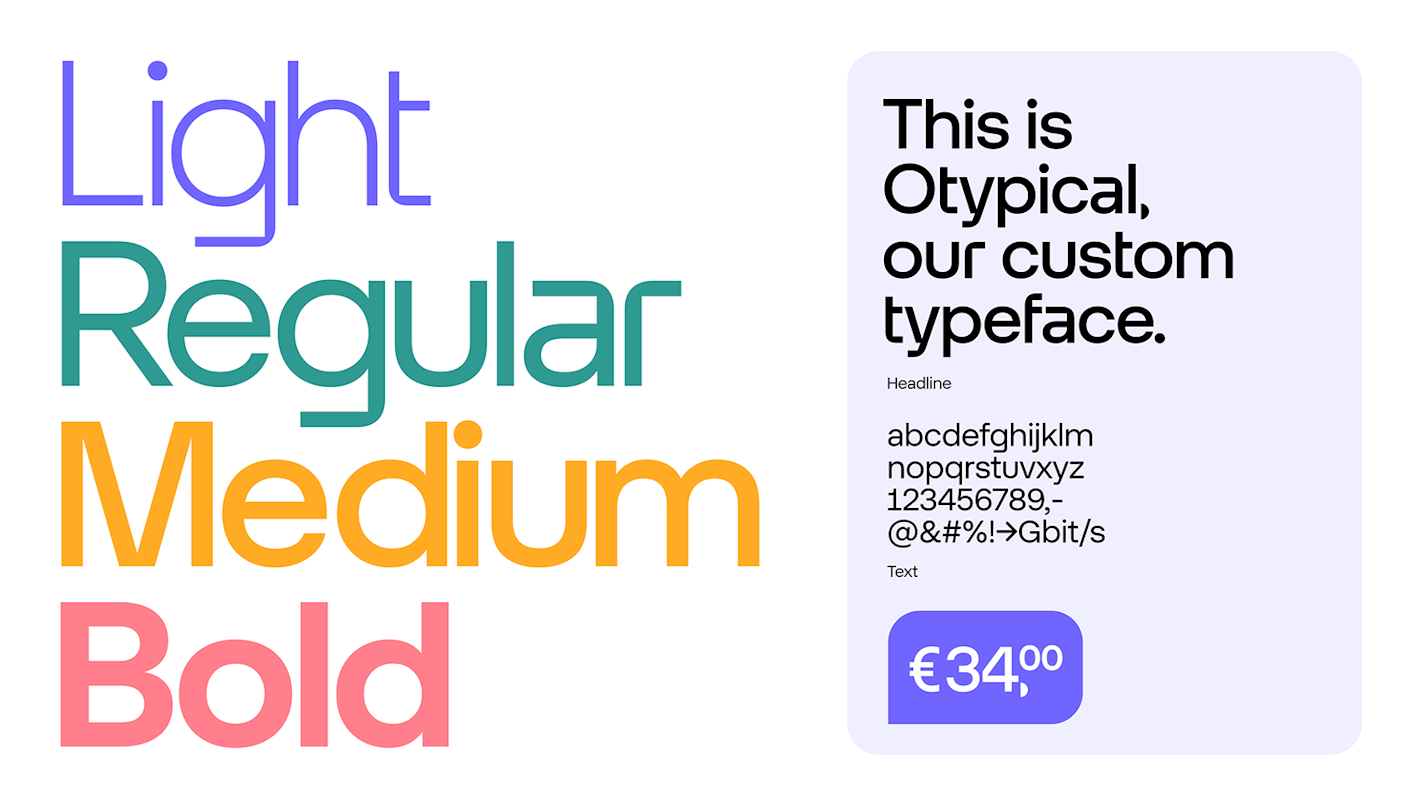
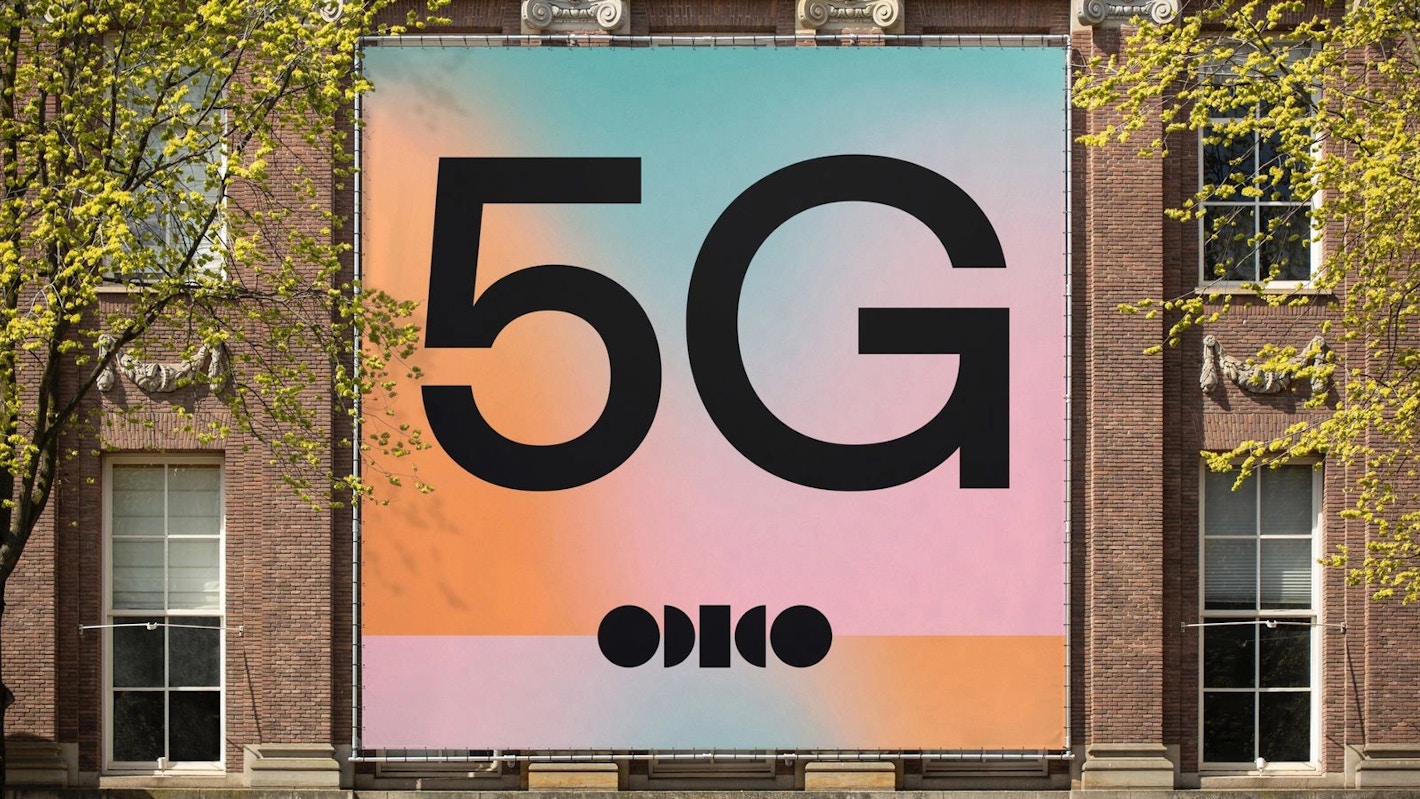
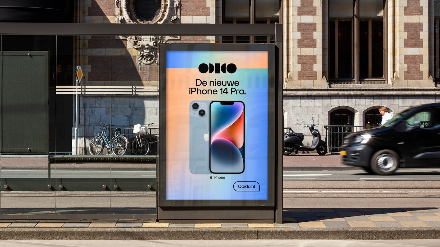
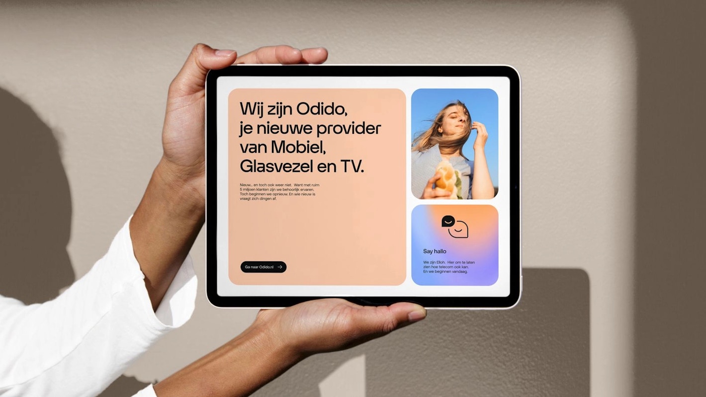
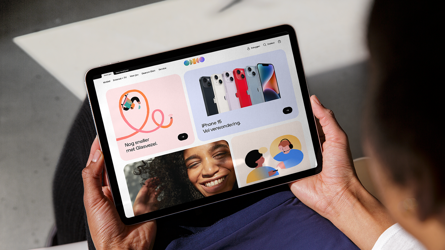
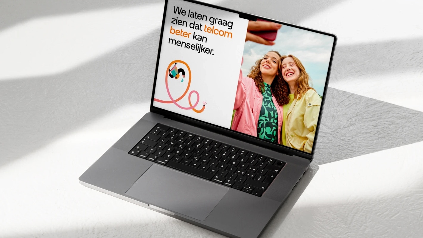
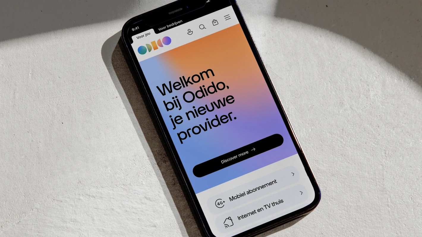
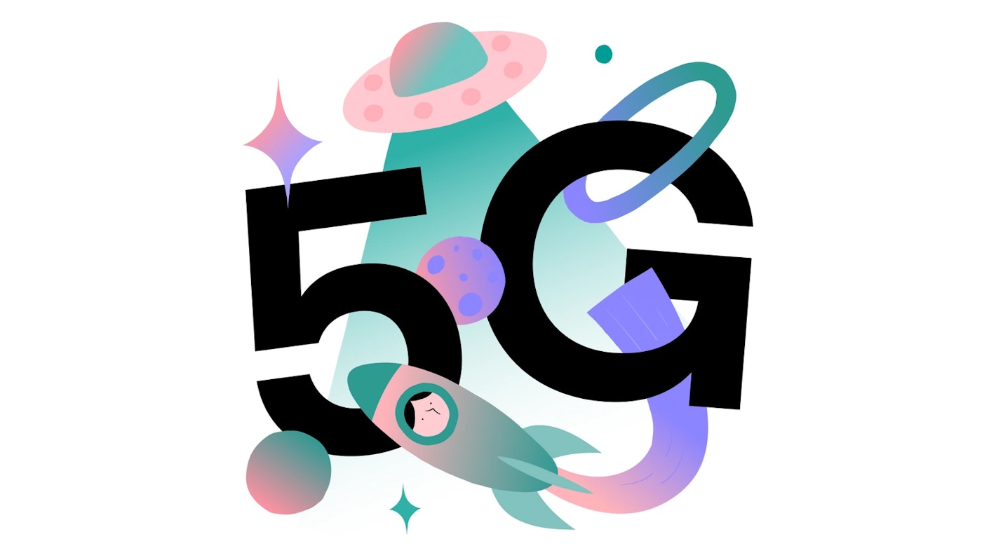
Otypical consists of two subfamilies – Headline and Text – each with 4 weights, Light, Regular, Medium, and Bold. The Text family includes italics. Right from the start, it was clear that Odido was going to be a telco brand, which needed to stand out from the pack. Functionality, luxury and simplicity were all qualities that the new typeface was meant to reflect. The headline family is meant to perform well at very large sizes and be the main protagonist, while complementing the photography and “glow” (gradient) that define the brand. The Text family is meant to work well at small sizes and can be perceived as the supporting actor —it is functional and accessible, while still retaining some of the DNA of the leading typeface.
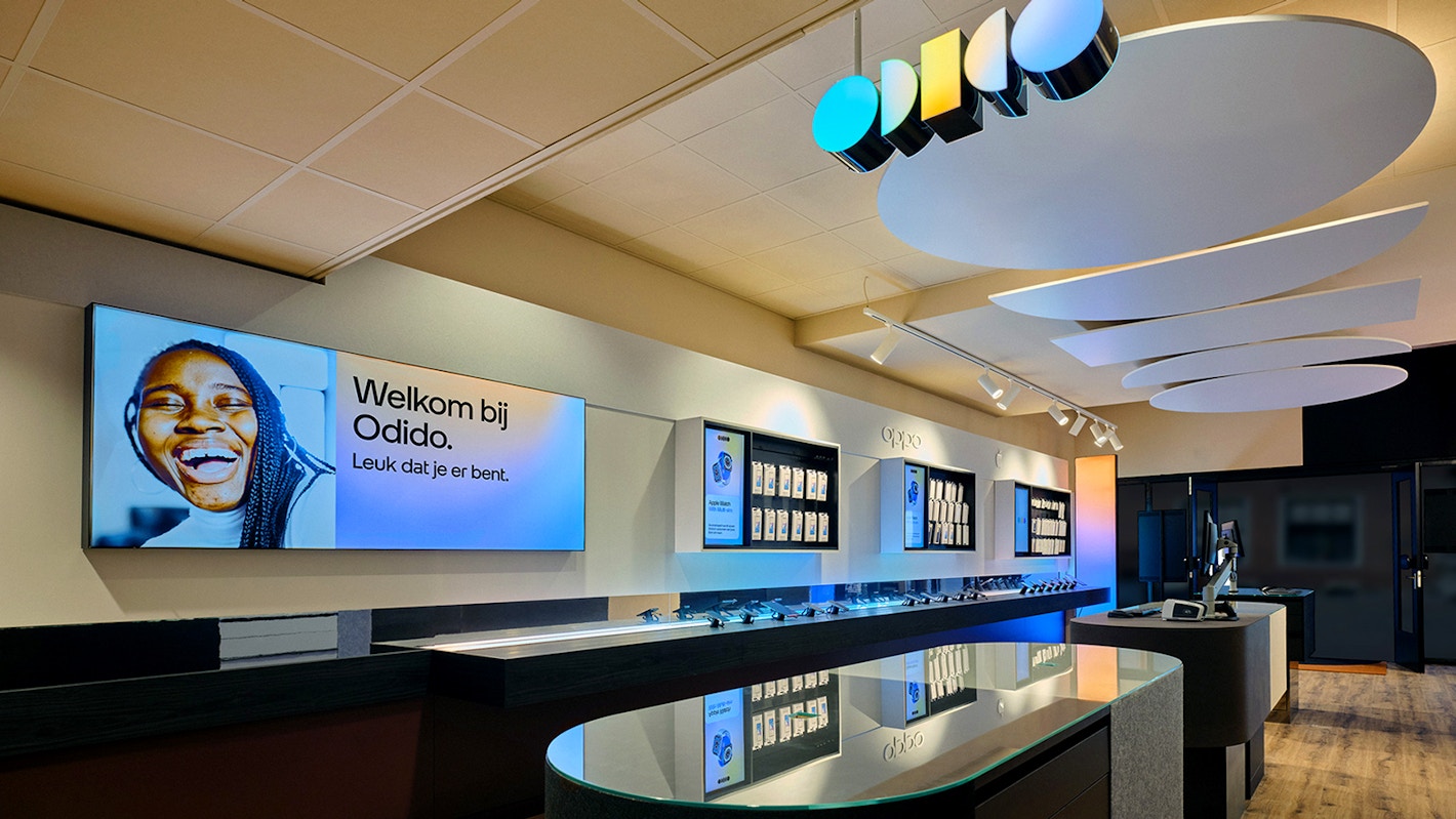
In deciding the design direction for this typeface, the client embraced the theme “forward”, which resulted in simplified shapes with a technical skeleton form, based on the geometry of the logo. The tension that results from the circular and rectangular shapes in the logo is echoed within letters like ‘a’ and ‘r’ with the sharp corners on the inside and softened curves on the outside. The wide apexes in ‘v’ and ‘z’ give stability and a sense of futurism and uniqueness to the typeface. Both type families have been optimized for digital use, as they have been applied on all digital platforms of the Odido brand, including digital TV interface, phone applications, and hundreds of other digital touch-points.
Special thanks to Diana Ovezea at Blast Foundry for type design and font engineering support.