
AFC Ajax
We’re proud to share the custom typeface we created for AFC Ajax, commissioned by Smörgåsbord and Ajax.
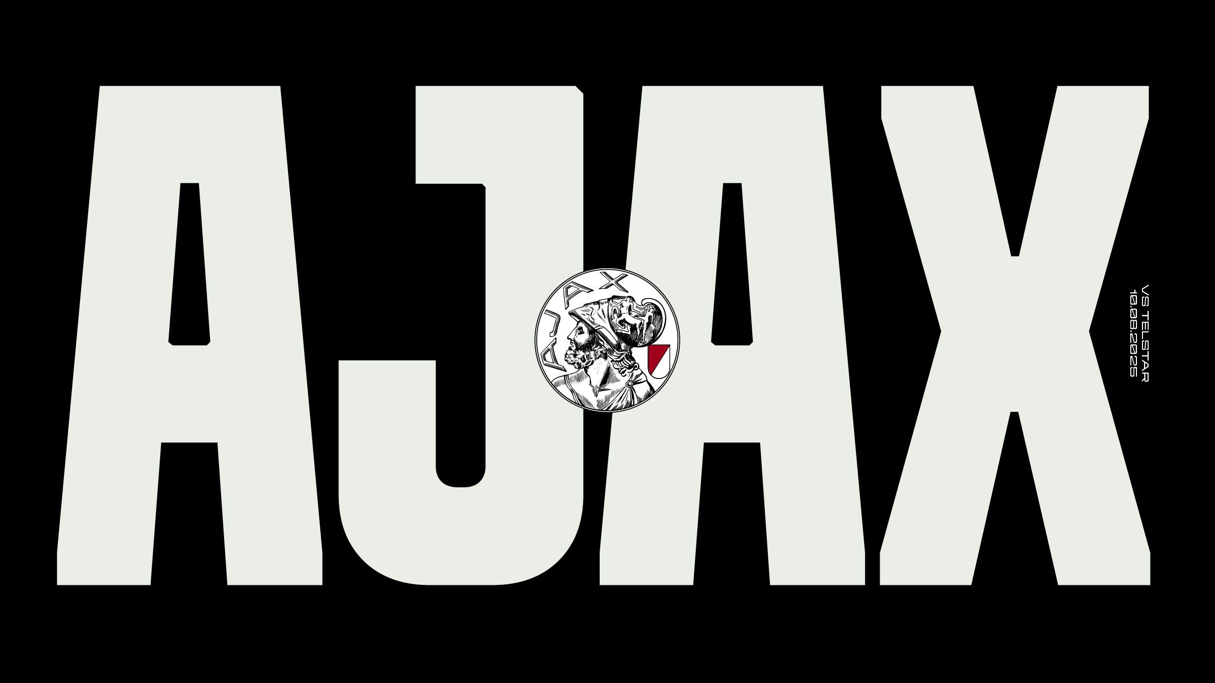
The design takes its lead from the club’s iconic 1928 logo – especially the flat-top A and bold, geometric structure – and reinterprets those elements into a modern, functional type system. Rather than recreating the past, the goal was to build a new voice for the club: clear, confident and versatile, with just enough edge to feel distinct. It needed to hold its own across shirts, stadium screens, merchandise, motion, and editorial. as well as scale up without losing character.
The result is a versatile family built to perform at large sizes, with five weights across three widths – Condensed, Standard and Extended. A constructed feel, micro bevels, and consistent notch angles give the typeface its edge, while the wide apexes nod back to the original logo and help the typeface feel grounded. Every detail was drawn with care to keep things crisp, cohesive, and adaptable across formats.
Diana Ovezea led the development of the type family on behalf of CoType, working closely with Smörgåsbord and the in-house team at Ajax. The process was fluid and well-aligned from day one, guided by a clear brief and a shared vision, making it a rare and rewarding kind of project.
We’re excited to see the club already making the typeface their own – from daily social posts to matchday graphics – with full rollout across the stadium and beyond still to come.


